Email Design Best Practices
Is your email good to land in your client’s inbox?
The Anatomy of
Heavenly Email Design
The world of Email isn’t dead. Infact, more marketers are marking Email as an important marketing technique in to their calendars.
To create heavenly emails, is thus imperative. Below, we have outlined the elements that play an important role in creating spine chilling email designs, as well as the
pitfalls that can affect the performance.

1. Brand Optimization
A. From Name:
Include your brand name in the From Name.
B. From Address:
Use an identifiable From Address.
C. To Field:
To field of your email should be personalized to the recipient’s name, not their email address.
D. Subject Line:
Use an informative, short and recognizable subject line. Limit the words to 35 characters or less. Dont’s use ALL CAPS or spammy words, though the most important factor for spam filter is domain reputation. However, subject lines plays a role when reputation is low.
Use UTF 8 special character symbols in subject line only if it is highly relevant.
Use UTF 8 special character symbols in subject line only if it is highly relevant.

2. Pre -header & Header
A. Online version:
Include a link to an online version of your email.
B. Snippet Text:
Few email clients like Gmail/Outtook/iPhone etc show snippet or preview text (usually limited to 100 characters or less) Here, the text will be pulled out from the first few lines of email content. Use this valuable property to build on subject line.
C. Johnson Box:
(Preview Pane top 400X300 Pixels)
- This is the most valuable area of your email which plays a major role in engaging your recipients.
- Put a Line of text that describes the content or purpose that motivates the recipients.
- Try to keep header less than 150 pixel height to avoid pushing your main message and call to action below Johnson Box.

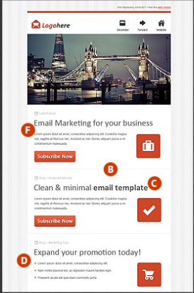
3. Email Layout
A. Ideal email width - 500 to 650 pixels.
B. Vertical layout over the Horizontal is preferable.
C. Text and images should be used in a right proportion.
D. Use a table of content if you have a lot to cover.
E. If you have multiple products/categories to display, provide a navigation bar.
F. Use 4-5 panels of area for visual emphasis that offers specific eye path for key offerings.
G. Calls -to-action should be clear & enticing.
4. Visual Impact
A. Graphics & Imagery should delineate the content sections well. Images speak louder than words.
B. Whenever an image is used, it's important to provide fallback color and alt -text for the image.
C. Try to avoid background images layered with text. Many of the email clients (Outlook, one of them) don't support background images.
D. Make feature headers or product offers readily clickable.
5. Copy & Content
A. Use short sentences and paragraphs.
B. Use design elements like spacing and dividing lines to distinguish the content sections from one another.
C. Use bold typeface and subheaders to make certain words stand out.
D. Use bullet points to showcase benefits.
E. Use web -safe standard fonts. For Eg. Anal, Anal Black, Anal Narrow, Comic Sans, Courier New, Georgia, Impact, Tahoma, Times New Roman, and Verdana. However there are ways to setup non-standard fonts in an email by providing one of the web -safe fonts as fallback font.
F. Ideal font size for body copy is 14 pixels and title is minimum 22 pixels which provides a decent readability on mobile phones.
G. Double check your copy for spellings and grammar.

6. Footer
A. Include Organization's complete contact details.
B. Don't hide the unsubscribe button.
C. Include links to main section of your website or key services/product categories if possible.
D. Make it easy for your audience to share your email by including social sharing links and/or 'Forward to a Friend' options. Encourage the viral affect.
E. Add a line about 'Why your recipients are receiving this email?' to decrease chances of SPAM complains.
Avoid

A. Rather than embedding videos into emails, use a still image linked to a landing page containing the video.
B. No Flash or Ajax functionalities.
C. Avoid using GIF.
Worth considering

A. If the images you are using, turns off after landing in to the client's inbox your message will not be conveyed. Design your email keeping in mind that the message is conveyed without relying on images to load.
B. When creating HTML emails, include a plain text version that is easy to read and structured for quick scanning.
Mobile Email Design Checklist
A. Email Width:
Stay under 600 pixels for Android. Litmus suggests 320 to 550 pixels.
B. Create tappable calls to action:
Your creative calls-to-action need to be eye-catching, in center and tappable, with a minimum size of 44 x 44 pixels.
C. Layout:
While newsletters are typically designed in two or three columns, mobile optimized email should be designed in
a single column template.
a single column template.

D. Finger Targets:
Increase font size, line spacing, button sizes and white spaces to make it easy to touch and go for the touch screen mobiles.
E. Visibility of call to action and Links:
As mobile devices don’t support hover states, make sure your links, buttons etc are clearly visible as clickable objects.
F. Coding Methods:
Choose Responsive or Scalable email coding standards while developing your email that uses rich media queries to shape your email based on the screen resolution.
 To experience the difference between Responsive, Scalable & Fixed email layouts visit DeepFocus or scan the OR code from your mobile.
 Download the printable version
of Email Design Checklist at https://deepfocus.in/elements-good-mail/